Tips
Christopher Noto
Jul 14, 2024
Learn how to use color psychology to influence mood and perception in your interior design. Discover how different colors impact space and practical tips for selecting the perfect hues for each room.
Harnessing Color Psychology in Interior Design: How Colors Affect Mood and Space
Introduction
Color psychology is a fundamental aspect of interior design, shaping both the emotional ambiance and spatial perception of a room. Understanding how different colors impact mood and perception can help you create spaces that align with your desired atmosphere and functionality. In this blog post, we’ll delve into the principles of color psychology, explore how colors affect mood, and provide practical tips for incorporating color into your interior design.
1. Principles of Color Psychology
A. The Impact of Colors
Emotional Responses: Colors evoke a range of emotional responses. For example, warm colors like red and orange can stimulate excitement and energy, while cool colors like blue and green tend to calm and soothe. Understanding these associations helps in choosing colors that match the desired mood of the space.
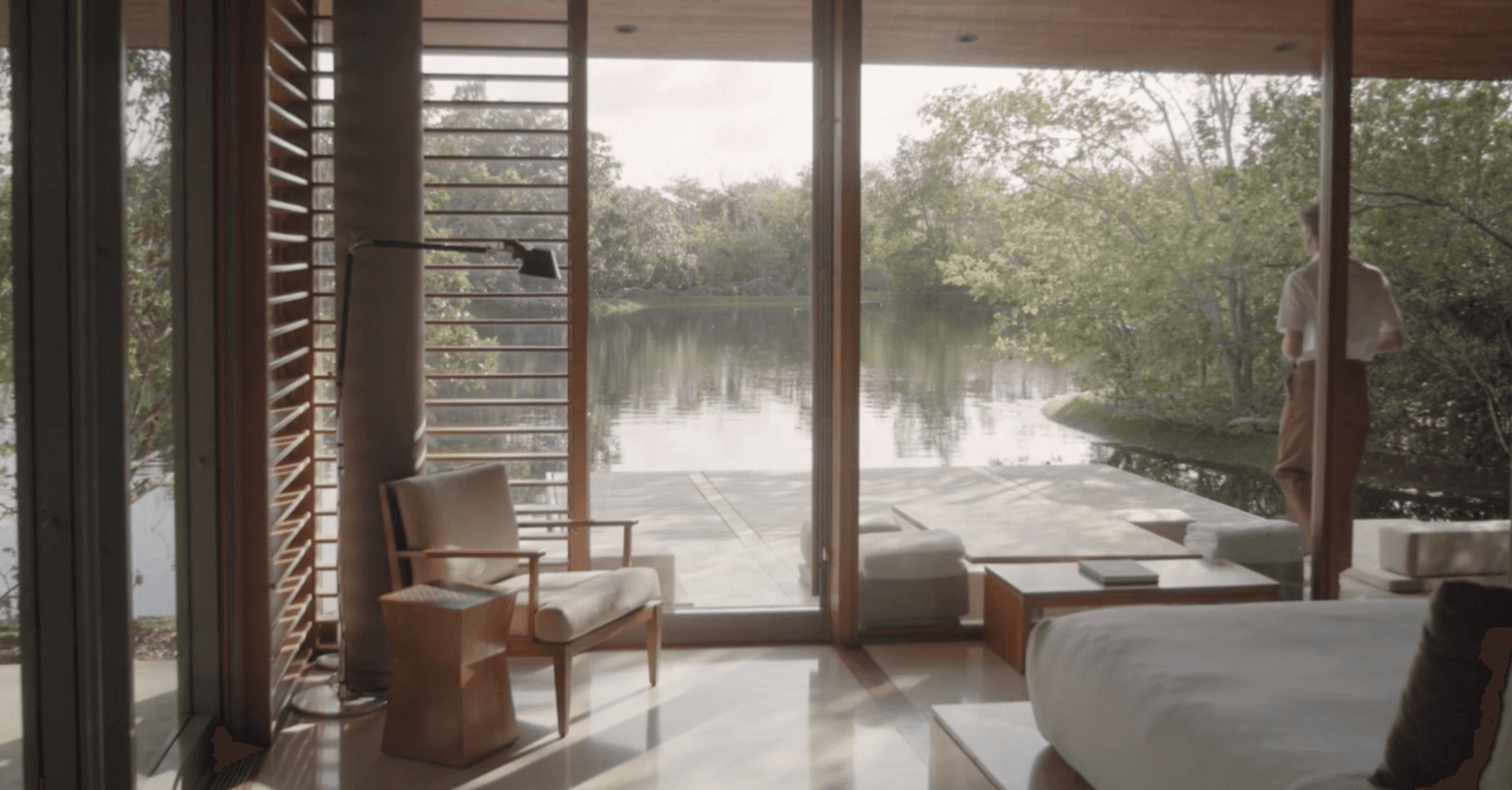
Spatial Perception: Colors also influence how we perceive the size and shape of a space. Light colors, such as whites and pastels, can make a room feel larger and more open, while dark colors create a cozy, intimate environment. This knowledge is useful for manipulating the perceived scale and atmosphere of a room.
B. Color Associations
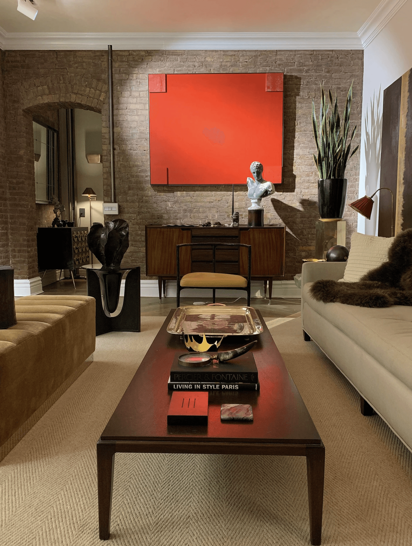
Warm Colors: Colors such as red, orange, and yellow are associated with warmth, energy, and enthusiasm. They can invigorate a space and make it feel lively and dynamic. Warm colors are ideal for social spaces where interaction and activity are encouraged.
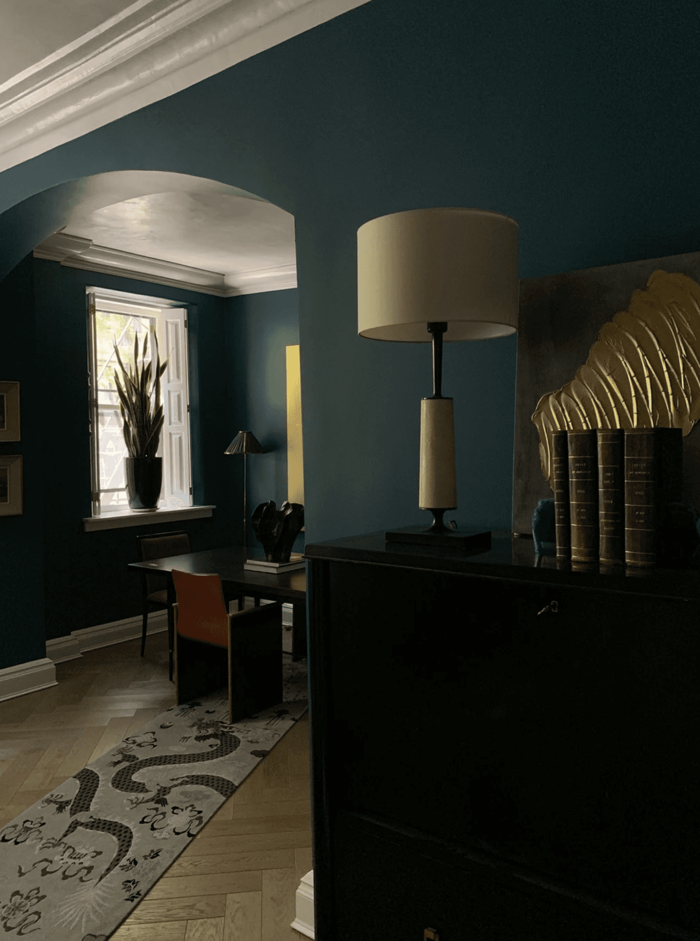
Cool Colors: Shades of blue, green, and purple are linked to calmness, relaxation, and tranquility. These colors are perfect for spaces intended for rest and relaxation, such as bedrooms and meditation rooms.
2. Choosing Colors for Different Spaces
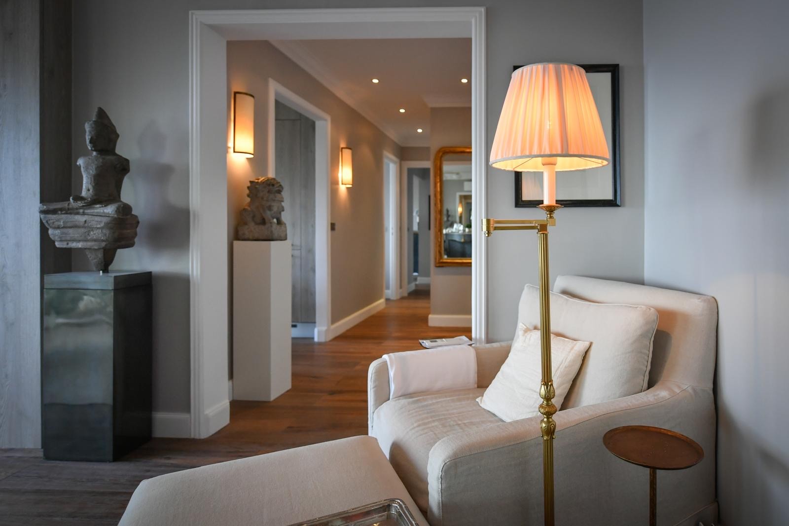
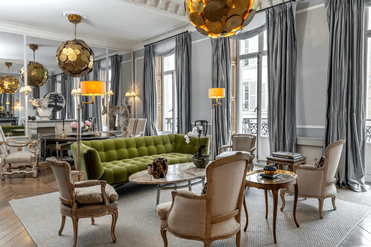
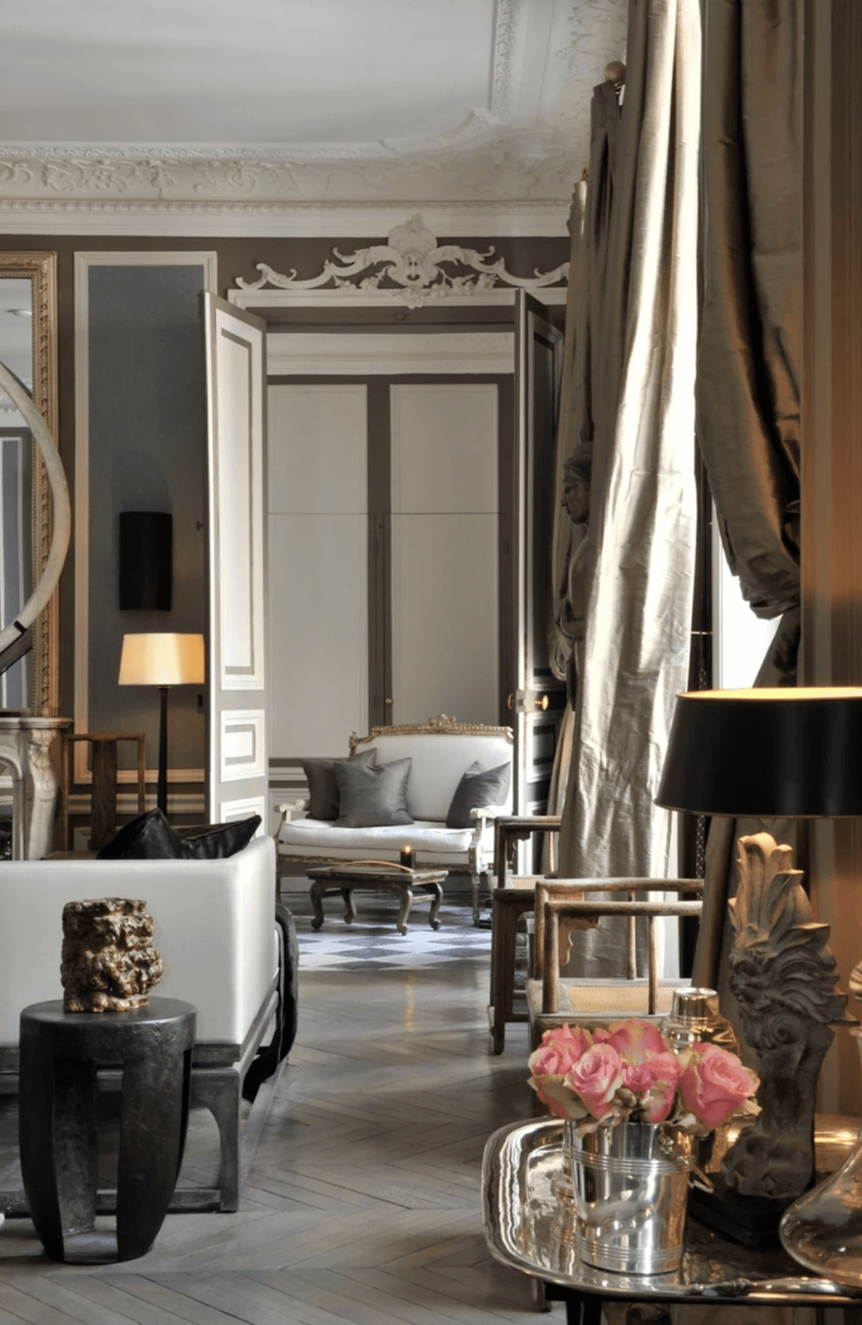
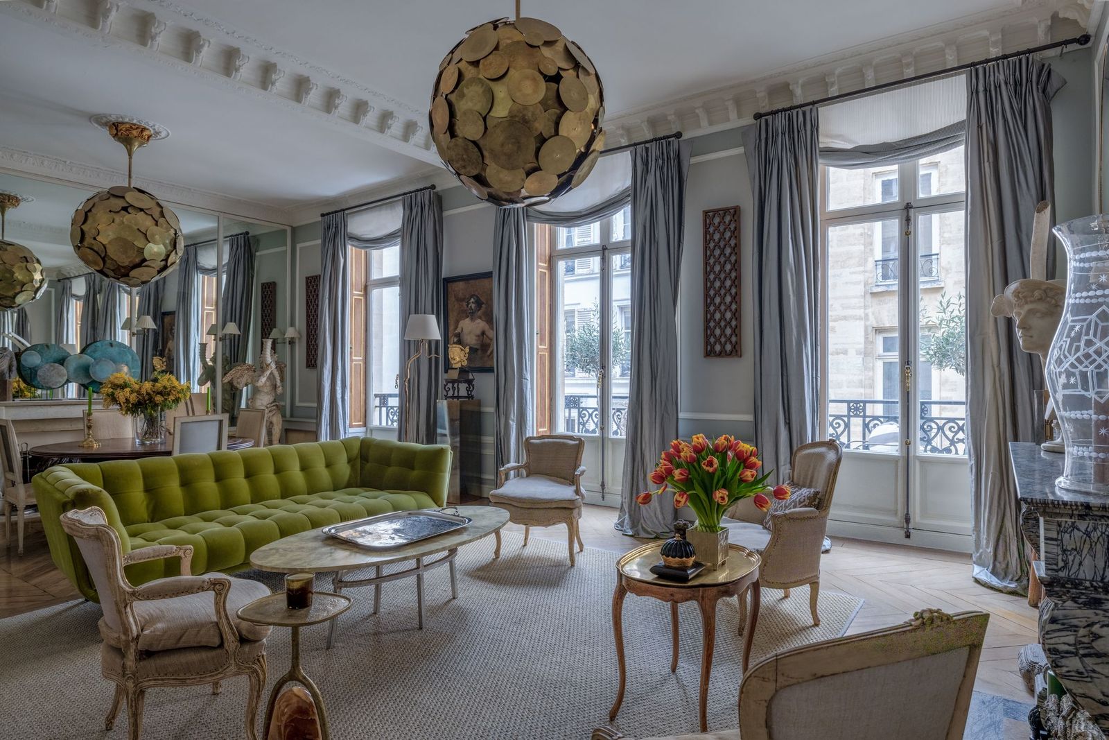
A. Living Rooms
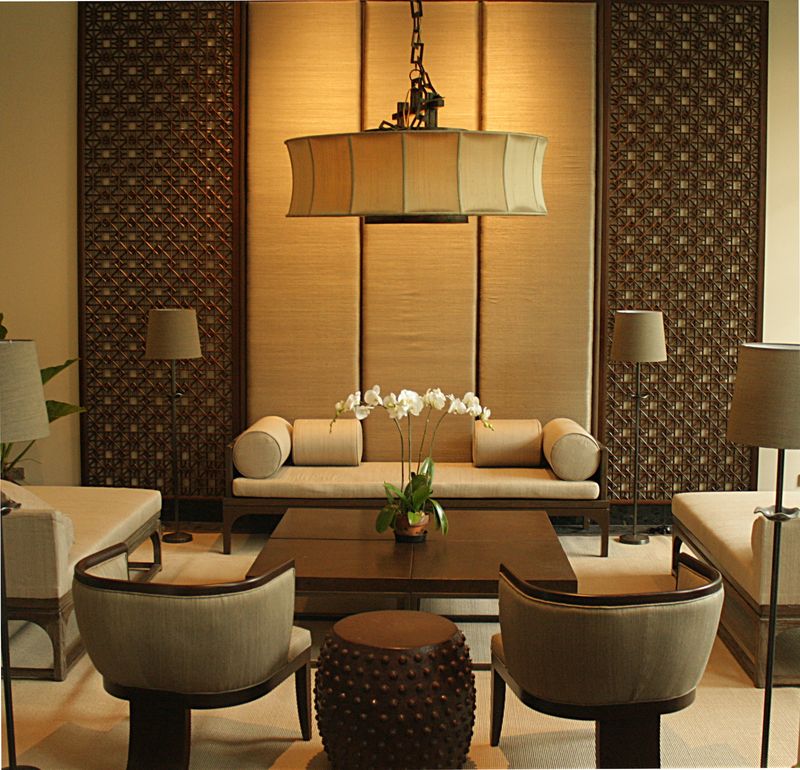
Warm and Inviting: Use warm colors like earthy tones (terracotta, ochre) or soft neutrals (beige, taupe) to create a welcoming and comfortable environment. These hues foster a friendly and hospitable atmosphere, ideal for socializing.
Accent Walls: Incorporate bold accent colors such as navy blue or forest green to add personality and visual interest. Accent walls provide a focal point without overwhelming the entire space.
B. Bedrooms
Relaxing and Calm: Opt for cool, soothing colors like soft blues, greens, or lavender to promote relaxation and restful sleep. These colors create a serene environment conducive to unwinding and sleeping.
Sleep Quality: Avoid overly stimulating colors like bright reds or intense oranges in the bedroom, as they may disrupt sleep or create restlessness.
C. Kitchens
Energizing and Fresh: Use bright, cheerful colors like yellow or mint green to promote an energetic and refreshing atmosphere. These hues can make the kitchen feel vibrant and lively, enhancing the cooking experience.
Functional Zones: Consider color-coding different kitchen areas to improve functionality and organization. For example, use different colors for prep areas versus eating areas to delineate spaces clearly.
3. Practical Tips for Using Color
A. Creating a Color Scheme
Color Wheel: Utilize the color wheel to select complementary or analogous colors for a cohesive and harmonious look. Complementary colors, located opposite each other on the wheel, create a vibrant contrast, while analogous colors, next to each other, offer a more subtle harmony.
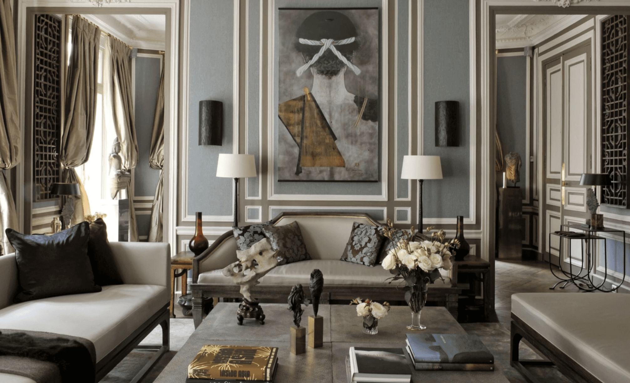
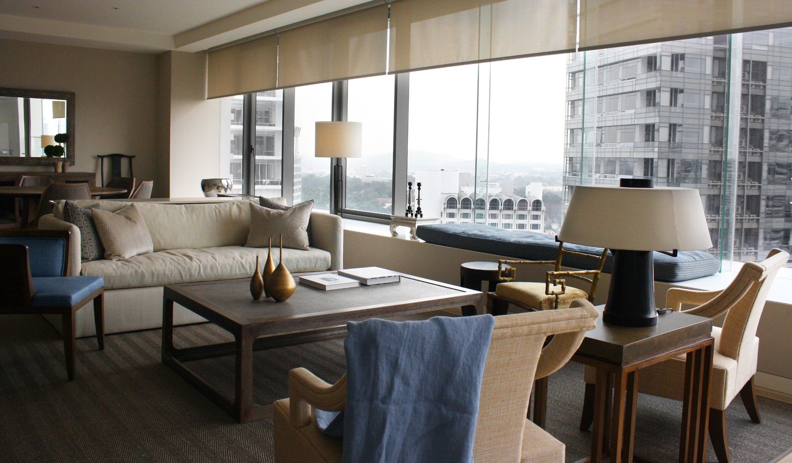
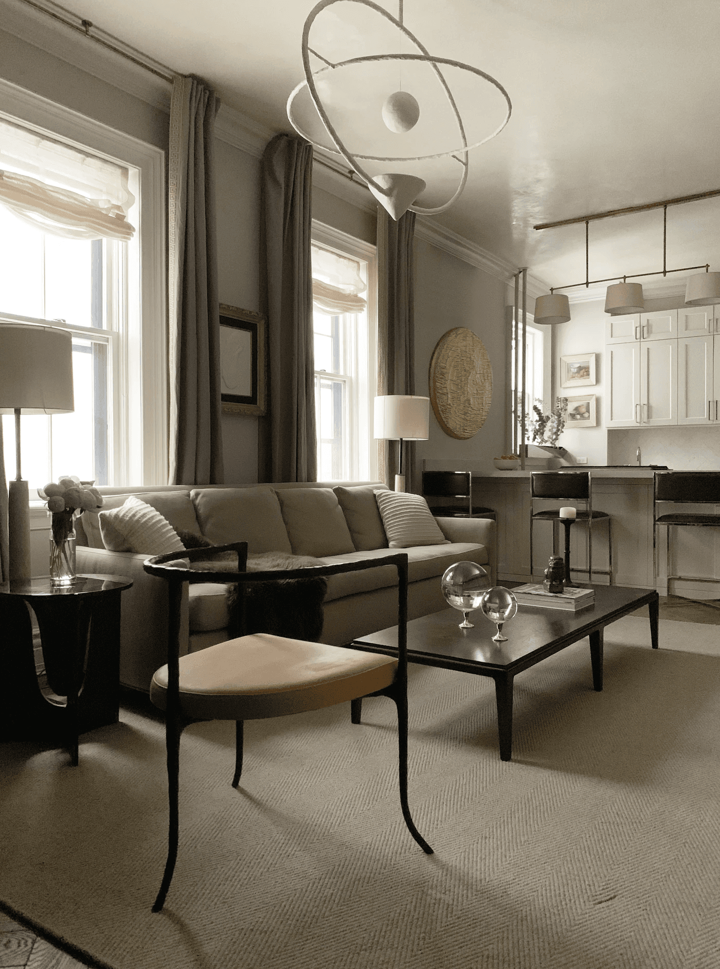
Neutrals: Incorporate neutral colors such as whites, grays, and beiges as a base to balance bolder or vibrant hues. Neutrals provide a versatile backdrop that allows more vivid colors to stand out.
B. Testing Colors
Swatches and Samples: Test paint colors and fabrics in different lighting conditions to see how they change throughout the day. This ensures that the colors work well in various natural and artificial light.
Color Mockups: Create mockups or mood boards to visualize how colors will interact and work together in your space. This helps in making more informed decisions about color combinations and placements.
4. Psychological Effects of Specific Colors
A. Blue
Calming: Blue is known for its calming effects, making it ideal for bedrooms and relaxation areas. It promotes tranquility and can help reduce stress and anxiety.
Focus: Light blue can enhance concentration and productivity, making it suitable for home offices or study areas.
B. Red
Energizing: Red is a stimulating color that increases energy and excitement, making it suitable for social spaces like dining rooms. It encourages conversation and activity.
Caution: Use red sparingly to avoid overwhelming the space or causing agitation. Balance it with neutral or calming colors to prevent visual overstimulation.
5. Common Mistakes to Avoid
A. Overuse of Bold Colors
Balance: Avoid excessive use of bold colors, as they can dominate the space and create visual imbalance. Balance bold hues with neutrals or softer tones to maintain harmony.
B. Inconsistent Color Schemes
Cohesion: Ensure that your color scheme is cohesive and complements other design elements. Inconsistencies can create a disjointed look and undermine the overall design.
6. Examples of Effective Color Use
A. Modern Living Spaces
Color Palettes: Modern spaces often feature neutral palettes with pops of bold color to create a stylish and sophisticated look. This approach allows for flexibility and easy updates.
B. Cozy Retreats
Color Choices: Use soft, warm colors and rich textures to create a cozy and inviting retreat, such as a reading nook or home library. These colors contribute to a relaxing and comfortable environment.
Conclusion
Color psychology is a powerful tool in interior design, significantly impacting mood, perception, and ambiance. By understanding the effects of different colors and applying them thoughtfully in your design, you can create spaces that evoke desired emotions and enhance overall well-being. Embrace the principles of color psychology to design interiors that are both aesthetically pleasing and emotionally resonant.

Design Insights: Tips, Trends, and Inspiration for Your Space
Search ressources